
Thursday, 2 October 2008
Unicef!
While moving house, I found this from a couple of years ago, which I'd kept. The reason that I'd kept it is because it really angered me and I thought was a shocking form of advertising. It came in the post addressed to me and consisted of a free diary, a fake sachet of rehydration solution and an information booklet and then it boasts that a real rehydration sachet could save a life and that it only costs 3p! I don't even know if it needs pointing out how many kids could have been saved by a cheaper way of advertising than giving out free unwanted gifts to people that haven't directly signed up for anything. I understand that they want people to give more than 3p and that there is a lot of money thrown into the advertising of charities it just really makes you question their morals. Its definitely not something that has inspired me creatively but it will make me think about other design considerations in the future.


Kigali Memorial Museum
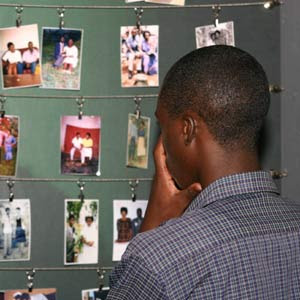 While we were in East Africa we were keen to go to the genocide memorial museum in Kigali. For me it was so shocking to learn that something this horrific had happened just over 10 years ago and I didn't even fully appreciate what had happened. Even today being in Rwanda you could see the effects, we spoke to people on the streets that had lost both of their parents to the genocide and saw people with no legs getting around on their hands because they can't afford wheelchairs. It really puts things into perspective and makes you think about whats really important. In our society where we idolise celebrities and worry about clothing and people get counselling for the smallest of problems. All these people had were life, family and fertility and yet there were people that wanted to take those as well.
 The museum itself was very moving. They told you the story through pictures and videos. Starting with what Rwanda was like before any colonisation it slowly progressed through to Rwanda today. The one video that touched me the most was one of some of the survivors talking about what had happened to them and or their relatives, the people talking were of a similar age to me. The video combined these stories with horrific images of injuries on children, dead mutilated people on the streets and weapons. It was difficult to believe some of things humans were capable of doing to each other. Whatever the museum did it was always going to evoke a lot of emotion however, they were very good at making you connect and relate to what had happened. A room in the centre housed many photos of those who suffered, they were personal photos of weddings, school, and general family photos. Another room had clothing and another skeletons. The clothing and the skeletons seemed to prove and bring home that it had actually happened whereas the personal touch of both the videos and photos made you relate and connect emotionally.
Walking through the streets of kigali it was difficult to believe that 10 years ago the bodies of family members of people we met may have been lying there. After visiting the museum it almost tainted the country everywhere I went I couldn't stop picturing what may have happened at that place.
Peepshow

Embarrassingly I have only just discovered the company Peepshow. They are a 10 people creative company that work with illustration, animation, and design. In the past they have worked with all the big names including Nike, MTV, BBC, Evisu, Fosters and many many more! Their work that interests me the most is their animation and illustration.Much of it could be described as cute, simple and colourful they also have many handmade arts and crafts aspects. I particularly like Marie O'Connor and Spencer Wilson's work. Their styles are very unique and it is clear which adverts they worked on from just from looking at their illustrations. For more of their work their website is also very impressive http://www.peepshow.org.uk/
Marie O'Connor
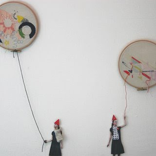
I like how she mixes fabric with print and uses simple shapes. Her work seems very feminine and quite delicate with the hand made feel.
Spencer Wilson
http://www.spencerwilson.co.uk/#
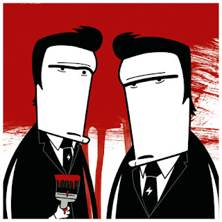
His work very contemporary and is easily recognisable. He has also done work for Orange, Design Week and Coca-Cola. I like the contrast between the black and white and the bright colours.
Howies Catalogue
I'm continually impressed with the howies catalogue and even though I have never bought anything from them I can't help but keep ordering it. The catalogue not only features their products but inspiration messages combined with beautiful and simple photography. Their passion for their morals and values is clear through all of their work. The catalogue also features information about things affecting the lifestyle they lead, the one that they are promoting and that many of their target audience lead, which really shows that they care. For example one issue gave information about the petition about the Welsh land reform Act. The images used have small tags about who the people are, where they are and what they were doing. It really gives it a personal touch and helps towards the feeling that the company really care, that they understand the audiences needs and they can relate to the audience.
Wednesday, 1 October 2008
Guerilla Advertising
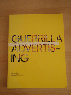

I bought this book from Magma in Manchester, it shows many creative guerilla campaigns from the past. To see the campaigns and how bizarre some are is inspiring like the krispy kreme flip flops it shows how some more obscure ideas can successfully work. The book creates a lovely collection of the campaigns, printed in high quality and with glossy images, the book really shows the campaigns at their best. The book itself is of such a high quality with a fully glossy, thick card cover. The cut out type on the front cover encourages you to open and pick up the book, combined with the bright yellow really makes it stand out on the shelf. The bright yellow also continues inside to highlight information. The straight lines, sharp edges and and sans serif fonts look really contemporary the negative space works really well and adds to the simplicity.
Pixar: 20 years of animation


I've always been interested in animation and when I was down in London a few years ago I was really excited to find out that the Pixar: 20 years of animation exhibition was on. Visiting the exhibition was amazing it showed the early drawings, first animations, storyboards and sculptures of Pixar. There were demonstrations of how different types of animation worked and it was a real eye opener. Unfortunately we were not allowed to take photos but I was so inspired by the exhibition that I forked out £25 for this amazing book. I love how it shows the earlier and unimpressive sketches it is a reminder that quality takes time even for those with a lot of talent. It was also really good to see and learn how their initial ideas had developed into something so professional.
Waltz with Bashir
I heard about Ari Folman's Waltz with Bashir from the amazing reviews it gained from the Cannes film festival earlier this year.This is just one review "Folman unleashes a pastiche of incredible cinematic scenes that are as innovative as they are devastating." Sheigh Crabtree, LA Time. The way he uses animation for such a serious matter is really unexpected and yet it works in such an way I've never seen before. It is directed amazingly with such detail in each shot, It is very easy to imagine it as an actual film. Its really worth a watch its definitely individual, heres the trailer :
Never Judge a book by its cover.........
I'm definitely not the biggest reader but occassionally I do read a few books. I am quite a fussy reader and I ashamedly would put a book down if I thought the font was too big or too small and so naturally I also choose my books by their cover. When buying this book I got drawn to the title, after picking it up I saw down the edge of the pages good is dead. When reading the blurb I learnt it was a novel about a graphic design student. The story itself was quite good but it is the layout that interested me. The edge of the pages read "good is" and then the book rotated reads "dead" on the other side although it does take some working out. The text on the page is also surrounded by quite alot of negative space which I thought was quite different for a novel. Annoyingly I used my book for a book exchange and now I can't find any pictures of the edge of the pages!

Here is the only picture I could manage of the top section of the negative space from the amazon looking inside facility.For a better look heres the link: ttp://www.amazon.co.uk/gp/reader/0743231023/ref=sib_dp_pt/203-5043444-5796708#reader-page
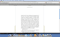
Here is the only picture I could manage of the top section of the negative space from the amazon looking inside facility.For a better look heres the link: ttp://www.amazon.co.uk/gp/reader/0743231023/ref=sib_dp_pt/203-5043444-5796708#reader-page

Hans Brinker Hotel
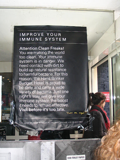
Hans Brinker is a budget hotel in Amsterdam however, its advertising is the key to its success. The campaigns celebrates and are completely honest about its crappy standards. Its bizarre approach uses humour to relate to people. They are selling all of its bad points but for some unknown reason it really works, I think it is the quality of its adverts. It is a prime example that you can sell anything with the right media. Here are some of its campaigns. Also the website is definitely worth a look to see more of the campaigns. http://www.hans-brinker.com/



runandjumpclothing
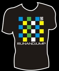
 The key purpose of my trip to uganda was on a kayaking trip. With many friends that kayak and making more while out there, I learned of some friends new clothing company called runandjump clothing
 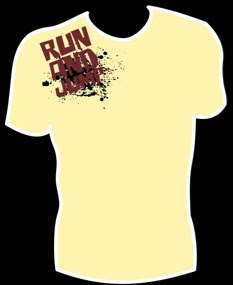 that they have completely set up themselves. Their enterprising business is really inspiring to me personally as it has allowed them to use their kayaking lifestyle and use towards a successful a business. It is using design in an area of my personal interest. Another friend has just started working for Palm a large kayaking equipment brand doing advertisements and banners etc. I also really like their designs and it is encouraging to see what can be achieved.
Zanzibar
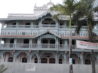

During my trip away I visited zanzibar and it is undoubtedly the most beautiful place I have ever been. In Stone town there are winding streets with intricate detail on nearly all of the buildings. With the islands history of slave trade there was much money to build these extravagant buildings at the time and for these reasons there is also a mix of arab, indian and european style that is quite unique.
Tuesday, 30 September 2008
type culture
Just found a really useful website about type it has some interesting movies that are worth a watch. http://www.typeculture.com/academic_resource/movies/
Mug
Street Sketchbook
This book is truly inspiring it makes you want to pick up a pen and draw. Although there are mixed feelings about graffitti artists, the book looks at their sketchbook work and you can appreciate what they do from an illustrators point of view. The illustrations vary in style looking at different illustrators, many are similar in style to those of minilogue and the carphone warehouse adverts. I was so impressed I might even buy the book. The video below is from the book launch in 2007.
Subscribe to:
Posts (Atom)


